Looking back at the preliminary task we were given, I feel like the final product is very much a reflection on how well I worked.
I am very pleased with my final product, however there were slight faults in my work, which I would change if I was given the task to do again. For example: I would change the typeface used on the masthead and heading for the contents page to one more suitable for the magazine. I’d have asked for opinions from my target audience on which font is preferred therefore I would have avoided the negative feedback about it.
I am glad that I choice not to break any conventions, even thought this may have been more interesting to do I don’t feel it would have been as passable as a real music magazine.
I liked the concept behind my magazine, being a magazine based on bands which are not yet establish however if I was to do this task again I think I would choice to base it on establish bands as it became hard to try and make up bands and information about fake artists.
My major disappointment was the final appearance of my contents page, I found that at the end I wasn’t very keen on the colour scheme and overall felt it didn’t fit in with the other pages, this also appeared to be the views of some of my audience during my focus groups.
Thursday, 7 May 2009


Evaluation- Technology
Adobe Photoshop

Some tools I used:
Magnetic lasso tool- During the production of my magazine I used the magnetic lasso tool a lot. It was used on my front cover to help cut around Abbie’s head so that I could copy and paste it as a new layer, therefore enabling me to overlay the masthead. In the double page spread it was used to erase the background of the main image, it is a very quick and easy way to outline a particular object.
Spot healing brush- I used this tool whilst photo shopping most of my images, it was used to erase any imperfections on the image, (e.g. blemishes on a person).
Patch tool- Similarly to the spot healing brush, I used the patch tool whilst editing my image. However this tool was used for trying to erase larger objects from the image, (e.g. an object in the background).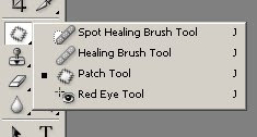
Burn tool- I used this tool when I wanted to darken certain areas on an image, (e.g. I used it to make the colour of the bra a much deeper purple) It can also be used to emphasise certain areas, (e.g. cheekbones), the opacity of it can be altered in order to make it blend with the photo.
Blur tool- I used the blur tool to help blend the edges of my main image on my double page spread, as beforehand I found that the magnetic lasso tool had left it very sharp.
Colour replacement tool- This tool can help change the colour in a particular image, I used it in one of the images on my contents page, as it had been an image taken of the same person as another image on this page. The changing of the colour of his t-shirt meant I could hide the fact it was in actual fact the same person.
Camera’s I used:
Canon 450d – I used this camera for my main images (front cover main image and double page spread images). It is a 12.2 megapixel camera and allows you to take continuous shots, it take a very clear, bright image, giving a more professional appeal.
Samsung NV3 – I used this camera for my other images. It is a 7.2 megapixel camera, although it does not take as good a photo as the canon 450d, it is a lot smaller and easier to manage, which was very useful for my second photo shoot at the giveaway’s gig.
Evaluation- Audience
(untitled) Reader profile:
‘Jane’ is far from plain when it comes to music, radio 1 for the mornings and kerrang! in the evening, her music taste varies from soft indie bands to hardcore heavy metal. She doesn’t like to blend into a crowd, with her bold brightly coloured hair that shows she doesn’t care about what others think of her. Her unusual dress sense means she gets a lot of odd glares from those unaware of her loving, caring personality. She has a very busy social life and her and her friends enjoy going to watch bands playing all over the country, festivals are a must for the summer time and keeping up to date with new and upcoming bands is important to her, therefore (untitled) is the perfect magazine for her.
Ideal target audience: Both sex’s however slightly more appealing to females,Aged between 16-20,Generally into soft metal/rock/indie/punk.
How my magazine attracts my target audience:
Attractive female, Men attracted to her, females envy her.
Piercings, purple hair on main image and the gothic make-up on inset image, all stereotypical things of my target audience.
Open mouth appeals more than a smile, a smile would be more friendly, whereas this shows a sign of rebellion.
Evaluation- Distribution
My magazine will be sold in all newsagents/supermarkets across the UK, It will be sold at a price of £2, this is an average price for music magazines, however special additions containing things such as free singles will be sold at a price of £4.50. As my magazine is a new magazine and will have little funding it will be owned by a much bigger company, for example Emap. This way there will be enough money to produce good quality magazines from the beginning.
Evaluation- Representations
Age- The age of the girl in my image is 17, I chose to use somebody from the age of my target audience as there are more likely to look at the image and relate with somebody of there own age than somebody much younger or much older.
Gender- Originally I did want my main image to be of both a female and a male as I felt this would be the most affective way of appealing to both sex’s however due to certain circumstances this was not possible, therefore my main image on my front cover is of a female. I would not have chosen to have the image of just a male on there own as I found out from my questionnaires that this wouldn’t appeal much to either sex’s. My images on my contents page are a mixture of both females and males as I did want to show the mix in genders.
Stereotypes- My image is a very stereotypical image of a person that would be into metal and the type of music my magazine is trying to promote, the bright big hair, the clothes and the piercings all help to create this stereotype. I chose Abbie for my main image on the front cover and for my double page spread as she fits my target audience, and by using somebody that fits my target audience in the magazine it will hopefully appeal more.
Evaluation- Forms and Conventions
Front cover:
Masthead – Conventional, top of the page, covers around 20% of the Front cover, Whole word in Capitals grammatically incorrect, informal. Black as it follows the house style of the magazine, Black will go with ever issue’s colour scheme. Overlaid by image which is conventional for most music magazines.
Typeface’s – Conventional, around 5 typefaces used, most quite similar to avoid being overpowering.
Strapline – Conventional, above masthead.
Selling line – Conventional, below masthead, overlaid by image which is conventional for most music magazines.
Date line – Conventional, Attached to the bar code.
Inset images – 2 images, Conventional, both images in bottom third.
Sticker – Conventional, advertising free posters, bottom of the page.
Barcode – In bottom right third, Conventional, includes website, date and issue number.
Banner – Conventional, Bottom of the page.
Main image – Conventional, Main image also acts as background image for the magazine. Image overlays masthead, eye contact given, posed photo.
Headline – Conventional, takes up around 15-20% of the page, center of the page, anchors main image, typeface bold with an eroded effect.
Coverlines – Conventional, anchor the inset images, short, simple. Not much information given to encourage audience to read on inside. (However this was pointed out as a critism during my focus group).
Mode of address – informal, friendly, (e.g. biggest, hottest, loudest), appeals to my laid back audience.
Contents page:
Heading - Conventional, at the top of the page, large text, follows the house style, same typeface used as for the masthead on the front cover.
Images - Conventional, images used to represent features, drop-shadows used to lift them off the page.
Features – List of features given is Conventional, however slightly unconventional as not much information is given with them, simply the name of the artist/band.
Subscription box – Conventional, contact and price information given with past issues of the magazine.
Double page spread:
Image – Conventional, covers around a third of the page. Stretched between where the page will be folded in half, background erased from image.
Additional images – Conventional, only one other image used as the main image was quite large, any more images would have taken up too much space on the page.
Heading’s – 3 headings used, Top of the pages and the artists name below her image, Conventional, explain the articles below.
Text – Conventional, text frames the main image, broken up into paragraphs. Starts with a larger letter.
Article – Conventional, typical feature with interview intertwined and a short question and answer interview on the right hand side of the page.
Page number - Conventional, Bottom right hand corner, with magainze logo.
Byline - Conventional, journalist and photographer names given.
I chose not to break any conventions whilst producing my music magazine as I wanted it to be as believable as a real music magazine as possible, the majority of magazines follow these conventions and only on rare occasions break them, generally for a special occasion (e.g. anniversary of old artists death or first album etc), as my magazine was not based on any special event I saw no reason as to why I should try to break any conventions.
Subscribe to:
Comments (Atom)